The logo design industry is undergoing a dynamic phase of development, with more and more companies looking for ways to stand out from the competition. For years, the phrase «Don't touch the logo» was something of an inviolable rule, requiring logos to remain stable, intact, and often immune to any form of creative intervention. However, the How&How studio shows a different path, proving that flexibility in a logo does not necessarily weaken it, but on the contrary can strengthen the overall brand identity of an organization.
How&How, as mentioned in a recent article in DesignWeek, works against the logic of «don't touch the logo» by placing risk and the freedom to intervene in established elements at the core of the creative process. This approach goes beyond typical brand guidelines and emphasizes innovation, helping companies shape a more contemporary, interactive, and ultimately dynamic image. In this article, we will analyze how How&How's philosophy leads us to new ways of thinking about logo design, the importance of rebranding, and the ability of a logo to change according to circumstances.
Traditional brand guidelines recommend a strict approach: every element of corporate identity, from colors to typography, must remain unchanged, thus ensuring image consistency. This tactic has undoubtedly helped many companies achieve brand consistency, but in today's world of graphic design and visual communication, audiences are looking for fresh solutions and modern combinations.
International competition and the need for marketing strategies have pushed companies to highlight a more flexible, livelier side of their brand identity. As markets change rapidly, logos may need to follow contemporary design trends to avoid looking outdated.
A logo that can be «played with,» modified, and incorporate elements from different cultures or time periods offers new interest. This also strengthens the audience's relationship with the brand, as brand identity becomes a ‘living’ system, rather than a static entity that is repeated over and over again.
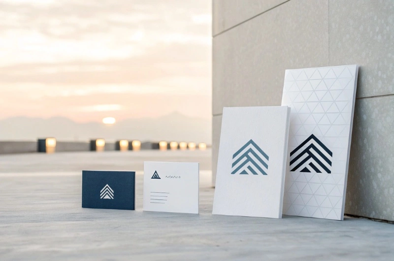
The How&How Approach: From Static Branding to Dynamic Branding
The How&How studio proposes a different approach that allows a logo to take on a fluid form and adapt to the objectives of each campaign or action. The How&How team explains that, instead of restricting designers and the marketing department for fear of altering a brand, you can aim for controlled exploration. This practice leads to design trends that convey a more contemporary, bold, and adaptive message to consumers.
So-called «logo influences» can come from a range of cultural, geographical, or technological elements. At the same time, rebranding supported by such a philosophy does not require you to throw away all elements of the previous logo. Instead, you can retain the core and enhance its key features, while introducing new, modern additions.
A dynamic logo not only emphasizes aesthetics, but also continues to «tell» a story. As part of the company branding strategy, we can instead transform the company's core message into a narrative sequence, placing the logo as the central narrator. Thus, each variation emphasizes a different aspect of the corporate philosophy.
Key points for creating a flexible logo design
How&How refers to the possibilities available to both large and smaller businesses when they choose to «ignore» the «do not touch the logo» rule—as long as they do so in an organized manner and with a specific action plan. Below are some steps that professionals and online store owners can follow:
Before making any adjustments, it is very important to define the central «purpose» of the logo. Which values and visual elements must remain unchanged? If the primary concept is simplicity, for example, any experimental change should support that simplicity.
The ability of a logo to be transformed into different forms can enhance brand recognition. For example, during specific holidays or campaigns, altering the logo (using colors that symbolize Christmas or a local holiday) can enhance the desired brand consistency, as long as the changes do not detract from the core concept.
Typography design contributes significantly to the aesthetics of a logo. Depending on the customization you choose, a different font can bring out unique aspects of the design's character. However, be sure to adhere to the principles of recognizability: if you completely ignore the central theme, the audience may feel confused.
Since many professionals operate primarily online, a flexible logo must be compatible with the entire range of digital tools. Whether we are talking about social media graphics or visual materials in e-shops, consistent design quality and proper size adjustment are essential. Also, take advantage of best practices from marketing strategy to place the logo in appropriate locations for optimal visibility.
The advantages for professionals and businesses
Experimenting with your logo does not always entail risks that will lead to negative results. On the contrary, it can lead to creative solutions that offer multiple benefits:
A modern logo design that exudes dynamism attracts more attention. As a result, it helps the brand stand out in a saturated online space. These elements often lead to better conversion rates, especially when it comes to e-shops undergoing intensive rebranding.
In today's digital world, communication between businesses and consumers is two-way. Social media, review platforms, and interactive communication give customers the chance to openly share their preferences. It is easier to gather opinions and adopt a more «participatory» approach to design. The audience feels more connected because they see that creators are taking their trends and comments into account.
When a brand learns to incorporate flexibility, future transformation initiatives become simpler. Whether it's minor color changes or a shift to a completely different graphic design direction, the foundations laid in the previous phase allow for easier transitions. This culture also allows for faster launches of new products or services without compromising the essence of the corporate identity.
Many companies operating globally are required to update their communication strategies, adapting even minor details in their logo to suit the local market. The example of HowHow confirms that modern logos can transcend cultural differences, provided they are designed with an open mind.
The message shared by HowHow through the philosophy “Don't touch the logo” – or rather «ignore it if you want to create something special» – reveals a new standard in logo design. Instead of viewing the logo as something static and inviolable, let's see it as an opportunity for dialogue, evolution, and adaptation. In today's commercial and technological era, where every brand is called upon to survive in a whirlwind of information, the unique touches of a modern logo can become a key pillar of success.
For professionals and online store owners, HowHow's proposal is an open invitation to experiment. While consistency and recognition remain the foundations of corporate identity, a modern approach to branding requires boldness and creative thinking. From choosing the right typography to incorporating social and cultural elements, rebranding a company can be a driving force that benefits both its image and profitability.
Link to Information Sources: https://www.designweek.co.uk/howhow-on-ignorning-dont-touch-the-logo-mandates/