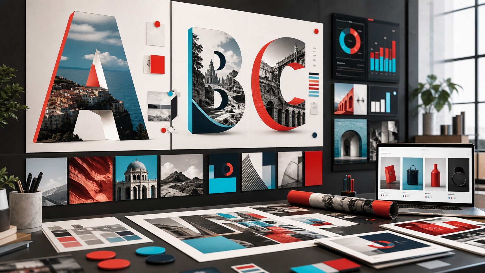
The article shows how culture, typography, and recurring design signals can become practical brand assets on websites, e-shops, social media, in emails, and in campaigns, with measurable commercial value.
At first glance, every weekly digest of the creative industry looks like a collection of great campaigns. But if we read it from a business perspective, something more useful emerges: the brands that stand out don’t just invest in eye-catching visuals. They build “design signals”—that is, recognizable elements that convey culture, context, and commercial intent. See also: Digital Marketing & SEO.
Design Week’s recent roundup highlighted examples of typography-led outdoor campaigns, cultural narratives, and impact-driven communication. For professionals, e-commerce owners, and marketers, the lesson is practical: when design is connected to a real context, it becomes a brand asset. It’s not just decoration. It’s a way to explain what you stand for before the copy even begins.
What Are Design Signals and Why Are They Valuable?
Practical reading: Design signals become brand assets when they are transformed into guidelines for typography, UX, content, social media templates, email, and campaigns, so that the brand culture can be recognized and measured.
A design signal is any visual, verbal, or experiential element that helps the audience quickly recognize the meaning behind a brand. It can be a typographic style, a color palette, a motion style, a pattern in product photography, or the way a campaign translates local culture into a visual identity.
Their value lies in reducing friction. In a feed full of messages, the user doesn’t have time to decipher complex promises. They want to quickly understand whether what they’re seeing is relevant, trustworthy, and unique. Good design signals act as shortcuts to trust.
The Airalo Example: Typography as Local Storytelling
From Aesthetic Culture to a Measurable Brand Asset
In the “Connection Means The World” campaign, Airalo and Stink Studios used typography-led OOH designs to make the concept of connection more cultural and less technical. According to the available campaign descriptions, nine local artists created typographic representations of cities and countries, drawing inspiration from signage, architecture, landmarks, and local visual traditions.
This is particularly interesting for marketers. Airalo could have focused solely on eSIMs, coverage, and convenience. Instead, the message shifts toward the experience: connectivity as a gateway to a more authentic travel experience. The product remains a technological one, but the communication takes on cultural significance.
For an e-shop or a B2B brand, the question is simple: what visual language makes our promise immediately understandable? Whether we’re selling premium equipment, marketing services, travel experiences, or software, it’s not enough to just look “trendy.” We need to consistently show what changes for the customer.
From Campaign to Asset: Design Should Be Reusable
Main decision
Which design signal should become a brand standard?;Start with the elements that users encounter most often: typography, tone of voice, visual rhythm, landing page structure, social media templates, and email style. If these cannot be consistently applied and measured, they remain merely aesthetic considerations.
A common mistake businesses make is treating every campaign as a standalone creative project. A set of banners, a landing page, a few social media posts—and that’s it. Design signals, however, perform better when they can be deployed across multiple touchpoints.
The same visual logic can be applied to performance ads, newsletters, hero sections, packaging, exhibitions, presentations, product pages, and short-form video. When done correctly, the brand doesn’t need to be reintroduced from scratch on every channel. The audience recognizes the brand’s visual language and associates the message with the company more quickly.
Cultural branding does not mean a general feeling
The PEDIGREE Mutt campaign in Brazil, featuring Ronaldinho Gaucho and created by AlmapBBDO, shows another side of the issue: the brand takes on a culturally charged meaning and strives to give it a positive, participatory context. This isn’t just “heartwarming” storytelling. It’s an effort to connect brand purpose, popular culture, and commercial recognition.
For smaller brands, this doesn’t mean they have to copy major cultural moments. It means they need to understand which everyday symbols, words, habits, or concerns truly resonate with their audience. A Greek e-commerce company, for example, can build a much stronger campaign around real-life uses, seasonal needs, and local habits than around a general global trend.
How does this apply to e-commerce and B2B marketing?
In e-commerce, design signals should help drive the purchase decision. This means a clear hierarchy, visual proof, consistency between the ad and the product page, and images that illustrate usage, quality, or results. If the creative promises a premium experience but the product page looks slapdash, the signal is broken.
In B2B, the need is different but just as important. Design must reduce uncertainty. Case studies, diagrams, dashboards, comparison blocks, and clean landing pages can make a complex service easier to evaluate. The goal is not to make B2B “fancier,” but to make it more understandable and trustworthy.
A Practical Framework for Marketers
Before launching a new campaign, it’s worth answering four questions. First, what is the business message that should stick in the audience’s mind? Second, what visual element can make it recognizable without much explanation? Third, across which channels should the same visual signal be used? Fourth, what should we avoid using because it looks just like everything our competitors are doing?;
This framework helps the team avoid creative chaos. It doesn’t stifle imagination. It gives it direction. When everyone knows which signals need to be protected, the design can evolve without losing its identity.
Steps to Turn Culture into a Brand Asset
- Step 1Here are the recurring design signals.
Identify the typography, visual rhythm, colors, photographic style, microcopy, and cultural references that should be recognized on websites, e-shops, social media, and in campaigns.
- Step 2Turn them into practical rules.
Create components, templates, tone rules, and usage examples so that the team doesn't have to rely on personal interpretation every time it produces content or a landing page.
- Step 3Combine aesthetics and performance.
Measure branded search, engagement, CTR, lead quality, conversion, and repeat business so that design culture can function as a commercial asset.
What to Consider Before Investing in a New Visual Identity
A new visual identity alone does not solve a positioning problem. If the brand lacks a clear promise, target audience, and proof points, the design will temporarily fill the gap but will not fix it. Conversely, when the positioning is clear, even small changes to typography, layout, image direction, and content architecture can increase perceived value.
The best approach is to start with the touchpoints that have the greatest commercial impact: ads that drive traffic, landing pages that convert, emails that bring back customers, and product pages that close the sale. That’s where you can quickly see whether design signals are actually helping or just making things look nicer.
Where is the value of design signals measured?
A suggested prioritization for brand systems that must integrate culture, digital touchpoints, and commercial performance.
Consistency in typography and visual rhythm
90
Implementation on landing pages and e-shops
86
Social media and email templates with a consistent style
82
Storytelling That Builds Trust
78
Measuring branded search, CTR, and leads
74
Do you want campaigns that can be measured?;
Digital Marketing & SEO by TWO DOTS
We integrate SEO, performance, tracking, and content so that every campaign is based on clear data and measurable business results.
Frequently Asked Questions
What does “design signal” mean in marketing?;
A design signal is a recognizable design element that conveys meaning about the brand. It can be typography, color, layout, photographic style, motion, or the way products are presented.
How is it different from simple branding?;
Branding defines the overall identity. Design signals are the specific elements that make this identity instantly recognizable across various channels, such as ads, social media, websites, and email.
Does cultural branding require a large budget?;
Not necessarily. It requires an understanding of the audience and consistency. A small brand can capitalize on local needs, seasonality, real-world product uses, and the language of its customers without imitating large-scale global campaigns.
Where should an e-commerce business start?;
Start with the areas that directly impact conversion: performance creatives, product pages, category pages, email flows, and landing pages. That’s where the right design signals have the most measurable value.
Does the design need to change for each channel?;
Yes, but not the underlying logic. The format varies by channel, but the main messages must remain consistent so that the audience can recognize the brand.
How do we know if a design signal works?;
We assess whether it improves brand awareness, understanding, and behavior. In practice, we look at metrics such as CTR, scroll depth, conversion rate, email engagement, branded search, and qualitative feedback from customers or sales teams.
What is the biggest mistake?;
Each campaign is created from scratch without a consistent system. As a result, the brand loses its identity, the audience doesn't recognize patterns, and the team spends more energy for less return.